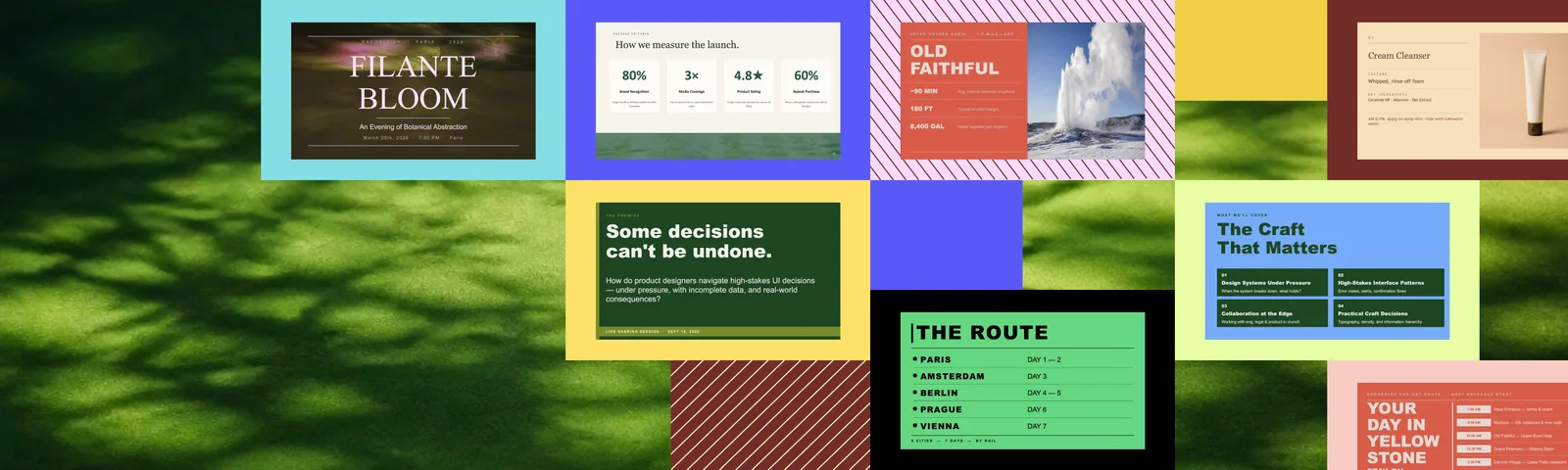
The hottest skill
Six Design Style Skills for Better PPTX
Turn topics into designed decks
Most AI presentation tools start from the same place: generate some slides, add a layout, make it look acceptable. Happycapy is taking a different approach with its new PPTX style skills. Instead of treating style as a thin layer on top of content, each skill behaves like a reusable design system. It defines the visual identity, layout rules, image direction, text density, and quality checks before the deck is delivered.
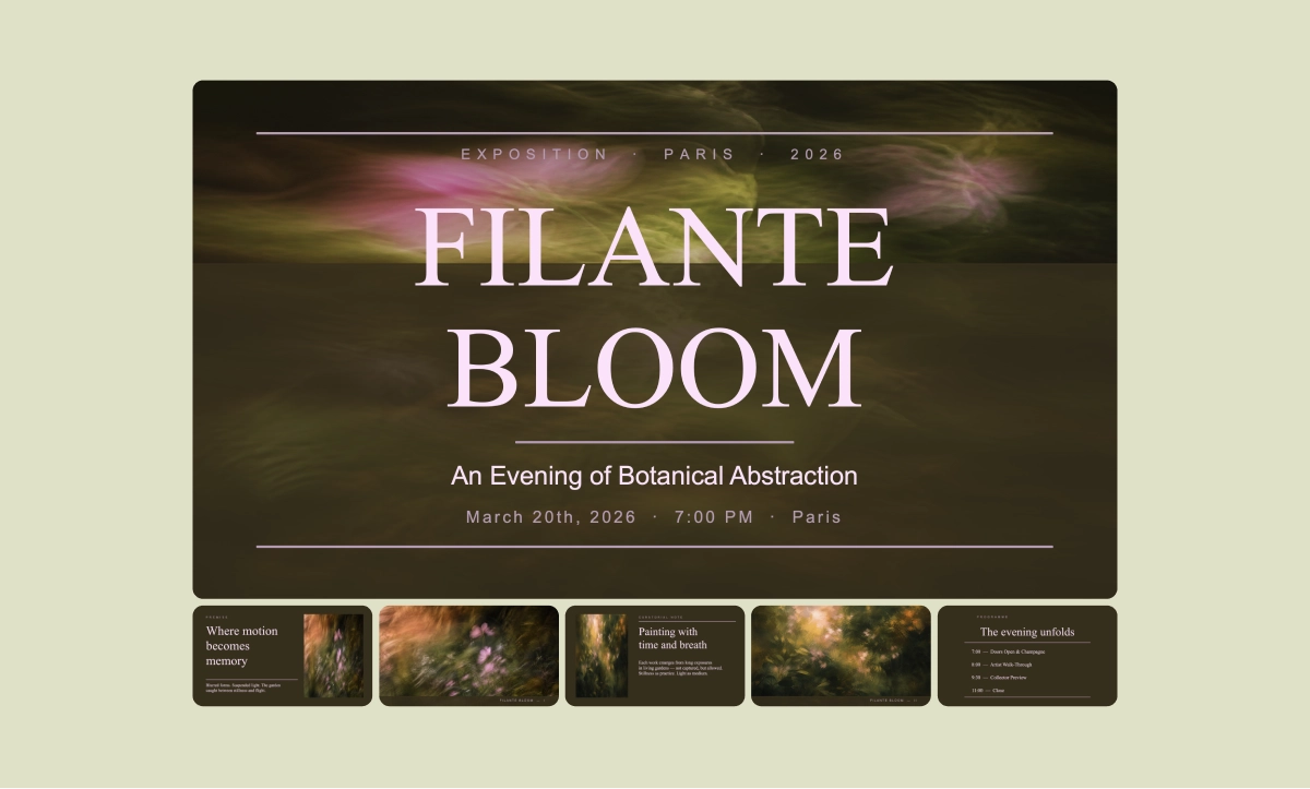
The first six styles now available in the Happycapy Skills Store show how different a presentation can feel when the design system is built into the workflow from the beginning. Olive Rose Salon turns any topic into a high fashion, poster led exhibition deck, with dark olive backgrounds, pale pink serif headlines, gold accents, optional botanical abstract images generated with gpt image 2, and strict text density rules. The result feels less like a report and more like a sequence of editorial posters.
SKILL
Olive Rose Salon PPTX
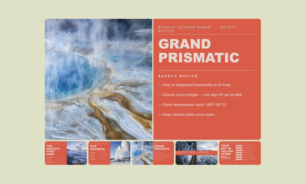
Coral Geyser Notice goes in a very different direction. It is built around the language of public notices, field guides, route cards, and visitor briefings. Its coral red background, warm stone typography, split screen composition, schedule grids, and route cue blocks make it especially useful when a deck needs to feel clear, bold, and immediately readable. It is a good reminder that presentation design is not always about being luxurious. Sometimes the best style is one that gives information a strong public signal.
SKILL
Coral Geyser Notice PPTX
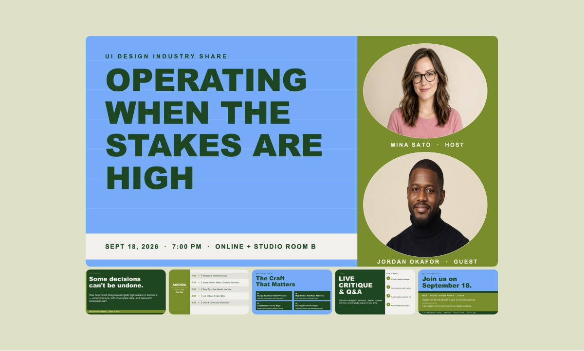
Azure Host Forum is designed for events, panels, workshops, and speaker driven presentations. It uses sky blue backgrounds, deep green typography, olive side columns, circular portrait frames, and optional editorial speaker portraits generated with gpt image 2. The structure naturally turns a topic into a premium industry forum, with slides for session premise, host profiles, agenda flow, core themes, and closing registration.
SKILL
Azure Host Forum PPTX
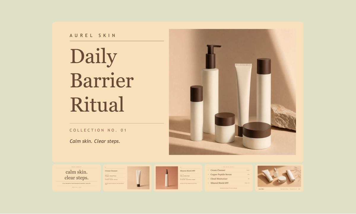
Apricot Ritual Index is the quietest of the six, and that is exactly its strength. It uses warm apricot backgrounds, cocoa brown typography, centered word stacks, thin rules, sparse images, and generous whitespace. It reframes topics as rituals, collections, indexes, and ordered sequences, which makes it especially suitable for product launches, brand strategy, research summaries, and premium editorial storytelling.
SKILL
Apricot Ritual Index PPTX
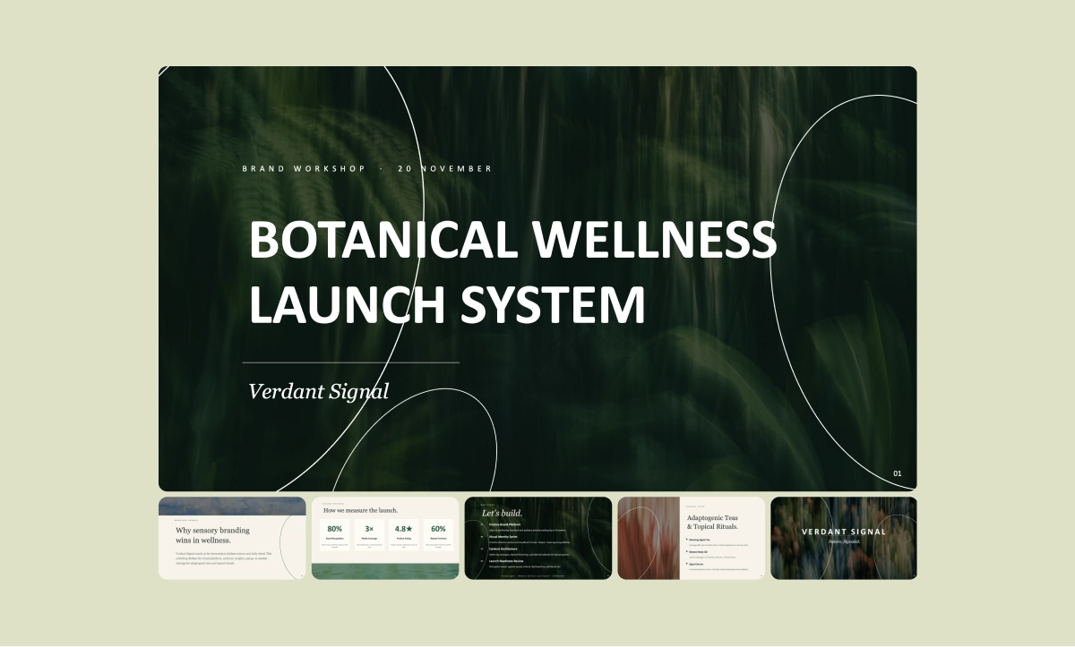
Botanical Blur System brings a more organic editorial language. It uses a six color system, botanical motion blur textures, white hand drawn leaf motifs, and a varied slide family that avoids repeating the same background over and over. The skill can generate botanical texture assets with gpt image 2, then combine cream editorial slides, full bleed texture slides, curved bands, rounded panels, side blobs, color fields, and information grids into one coherent deck.
SKILL
Botanical Blur System PPTX
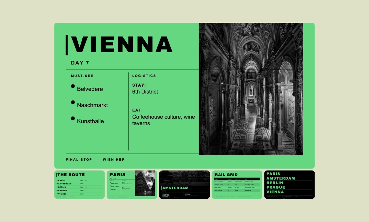
Signal Green Atlas is the most aggressive and graphic of the collection. It uses fluorescent green, black typography, high contrast black and white imagery, sharp rectangular windows, and strict two column grids. It reframes topics as atlases, sections, stages, milestones, and reference points, making it a strong fit for product roadmaps, research findings, climate data, or any subject that benefits from structure and attitude at the same time.
SKILL
Signal Green Atlas PPTX
What ties these skills together is the workflow behind them. Each one asks only a few focused questions, usually around topic, slide count, and image handling, then handles the rest through a defined visual system. The output is not a static screenshot or a locked design file. These skills build editable PPTX files with native PowerPoint elements, using PptxGenJS, and run visual QA to check for overlaps, collisions, readability, density issues, and layout consistency before delivery.
That is what makes these PPTX style skills interesting. They are not trying to replace taste with automation. They are trying to package taste into something reusable. You can choose the visual world that fits your message, then let Happycapy turn your topic into a deck that already understands its own design rules. For anyone who makes presentations often, this changes the starting point. You no longer begin with a blank slide or a generic template. You begin with a style system that knows how it wants to speak.
Start building with Happycapy
Happycapy is an agent-native computer for building apps, sites, and content with AI. Sign up free to run skills, prompts, and automations in one workspace.